10 Simple Merchandising Tips That Maximize In-Store Sales
Today's customer has less and less time for shopping. The vast majority consider shopping a chore—and a stressful one at that—so they place a huge premium on convenience. Is your store merchandised in a way that contributes to that stress, or is it set up to provide each customer with an enjoyable, stress-free shopping experience?
You want customers to be comfortable in your store and able to find what they need easily. The more comfortable they are, the more time and money they will spend with you. Here are some quick and easy ideas for making your store more shopper-friendly:
Give your customers space. Leave at least 4 feet between fixtures and at least 6 feet between fixtures and walls. The trend in retail today is toward more space, especially at entryways. Space says "class." (Notice that discount stores tend to be crowded.) Aim for an open look, particularly in the parts of your store where you offer higher-end instruments.
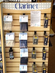
Display for the uninitiated, not the professional. Professional musicians know what they want and will usually find it, no matter where you put it. First-time visitors to your store should be able to find what they need easily—preferably without having to ask for help. One store I visited put instrument care kits in a row, neatly, in score order. But for a parent of a new beginning band student, score order is meaningless. If you put all the accessories for each instrument together, parents do not have to wade through trombone accessories to find something they need for their beginning clarinetist.
Eliminate SKUs. Customers with little knowledge or experience with musical products shouldn't have to make complicated comparisons or decide between too many SKUs. Customer confusion usually leads to the customer buying the least expensive product available or walking out, frustrated, with no purchase at all.
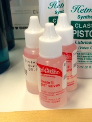
Display vertically, not horizontally. People can comfortably survey a visual field up to about 2.5 feet wide. Displaying vertically brings more items into sight range. (See photo.) Put related items together—such as mouthpieces and reeds, trumpet valve oil and tuning slide grease—to promote add-on sales.

Place merchandise between knee level and just above eye level. Customers shouldn't have to bend down or get on their knees to find merchandise. They also shouldn't have to ask for someone to get out a ladder. Wall space above 8 feet high is perfect for larger signage and other graphics but not for merchandise, even back stock. Placing slow-selling items in a more comfortable sight range can help your turn.
Display left to right, top to bottom. We read left to right, so our eyes move in that direction across our visual field and stop at the right. Put less-expensive options to the left and more expensive to the right. Place smaller items higher and larger items lower, so the visual field looks balanced. Be willing to move items if they aren't selling. In general, if people have to ask for an item frequently, it needs to be remerchandised.
Be careful with patterns. We hate to disrupt patterns. Putting items in neat, little rows looks nice but discourages customers, who may hesitate to mess up the pattern. Try a "bowling pin" arrangement instead. (See photo.) The odd man out just begs to be taken home.

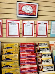
Get customers the information they need to be comfortable making buying decisions. Having to ask questions can add stress to the shopping experience. Use signage that educates. For instance, we label beginner band books so parents can find them easily. Clipboards hang above the books, so customers can see the area schools that use each title. (See photo.)

Signs should include features, advantages and benefits (FABs). Signs listing specs that aren't connected to a tangible user benefit are meaningless. Include prices on merchandise, as a lack of visible pricing can create suspicion. That said, put prices on the back, so customers have to pick up items and turn them over to see prices. Customers will be more likely to buy an item if they hold it.
Package items that belong together. Save your customers the frustration of getting home and realizing they're missing one item that they needed. We offer an Encore Package at a discounted price to every beginning band and string customer. The pack includes a method book (which we call a textbook), folding stand and instrument care kit. We don't want to upset a customer because a child went to school and found out he really did need that folding stand, and we didn't offer it.
Clean up, including the bathrooms. A clean store shows you care and will inspire confidence in your customers. Dust display instruments regularly, replace burned-out light bulbs, and make sure the bathroom has plenty of soap and paper goods.
As you strive for more customer-friendly merchandising, you will find more creative ways to display and package your merchandise. You will also find that your customers and employees are more comfortable with what you sell, and you will see your sales increase.
File Attachments

Join Us in Person for The NAMM Show
With a focus on innovation, the education offerings at The NAMM Show will help to prepare your business for the year to come.

Discover the Benefits of a NAMM Membership
Power our industry’s advocacy efforts by joining the NAMM community, featuring show access, education, discounts, networking, the Global Report and more!
